Case Study: Rebranding
BioLife Solutions redesign their visual identity in 2019, shortly before I joined the company. The result of this new effort appeared less than optimal for a company that aspired to become a true global brand, and it was clear the brand needed revision to scale with the company's rapid growth and represent its position as a leader in its industry. The following is a brief overview of the process used to research, develop, and apply the new BioLife brand.
The case for change
BioLife Solutions Identity
The 2019 BioLife Solutions brand was created to represent a company that provided "cell and gene therapy tools" to the biopharma market. The identity had issues in several areas. Its iconography presented a dated feel, with visual references that were more appropriate for a nuts-and-bolts hardware company than a global presence serving the leading edge of discovery and delivery of advanced therapeutics. Typography was unrefined and felt dated. The overall impression created by the visual was not consistent with the company's goal of establishing a modern global brand in their commercial space. Additionally, the tag line was too narrow for the range of products and services.
Building the new brand
A Focus on Process
Shortcomings of the 2019 brand were largely the result of a lack of process in arriving at a comprehensive brand experience by identifying brand requirements and desired company attributes. Logos and assets had been produced, but the brand had not been adequately defined and documented. The following overview offers a quick look at the process used to guide development of the brand's outer expressions, while also defining and documenting a more purpose-driven brand story, personality, and voice.
Research
The initial rebranding phase included an overview of existing brands in the same commercial space, along with an analysis of features that tied each brand to its mission and proposed company attributes. Surveys were then designed to identify a series of attributes that would represent the company, driving development of the brand, and informing ongoing marketing efforts. These surveys consisted of a series of questions provided to company founders, senior management, team members across the organization, and selected external stakeholders. Several rounds of questions were submitted over a three-month period, followed by a series of small group and individual interviews, conducted for the purpose of identifying:
Attributes
Stories and Themes
Customer Concerns
Differentiators and Competitive Advantages
Perceived Vulnerabilities
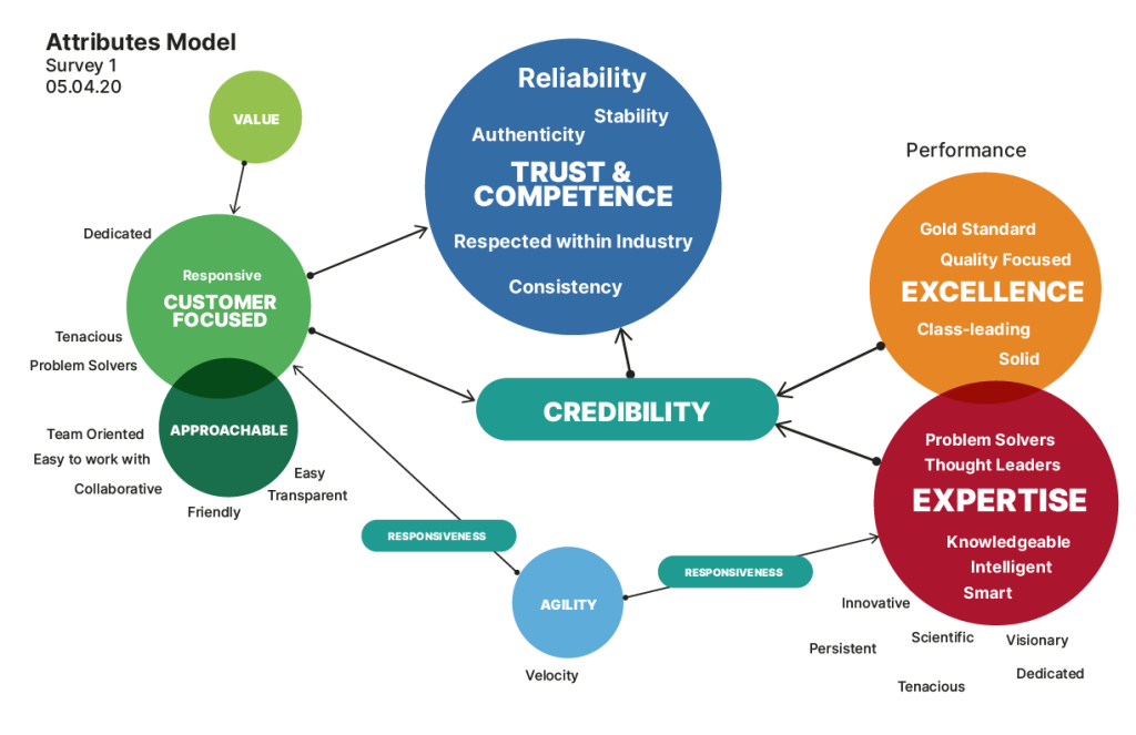
Attribute Modeling
Once surveys were completed, results were compiled with the initial goal of identifying a hierarchy of attributes that were consistent with the Biolife's mission, its capabilities, and the image it wished to portray. Responses were weighted according to frequency and diagrams were created to help visualize the relationships and relative importance of each entry. These diagrams were tested and revised over a period of several weeks.
Initial Brand Summary
The workflow solutions BioLife provides enable their customers to reliably address multiple points of potential failure in their processes, delivering therapies that maintain viability throughout the cycles of development and delivery. Stakes are high, and risks of failure include undesirable patient outcomes and a lack of payment for the therapy providers. Given this environment, it was no surprise that TRUST was identified as the core attribute that all other company attributes needed to support. From that point, a hierarchy was constructed with a branching structure of supporting attributes. These were used to inform design of the new visual brand and to guide creative direction on new efforts.
Initial Brand Summary Document
Redesigning Brand Visuals
With company attributes identified and a hierarchy in place, development began on the new visual brand. The goal was to work with abstract visuals and references that best aligned with the company's attributes in their order of importance. These are a few requirements documented to guide the design:
Clean, Modern, Precise
Conveys Strength & Stability
Enduring
Quickly Recognizable, Easy to Differentiate
Adaptable, Scalable
Memorable, Engaging
Narrative Qualities a Plus
Leveraging Familiarity
Early Candidates for Logo and Type Treatments
Final Logo Design
The final design for BioLife's new logo was selected for its clear, classic, memorable structure, and its ability to scale through customized application to various internal platforms and product verticals. Additionally, the logo presented a simple narrative opportunity, referencing a cell protected by a box — a theme consistent with BioLife's mission to protect the viability of living therapies.
Revising the Tag Line
The company's tag line was updated to move away from the pedestrian reference to "tools" in favor of a statement that offered language that was more comprehensive and solution-oriented. In considering the words "Tools" vs "Solutions", it was clear that the concept of providing a solution to the customer's problems existed at a higher level than selling them tools to address their needs. I was also more appropriate to reference solutions, as some of Biolife's newer offerings were more aligned with services than products.
Original Tag Line
Cell and Gene Therapy Tools
Revised Tag Line
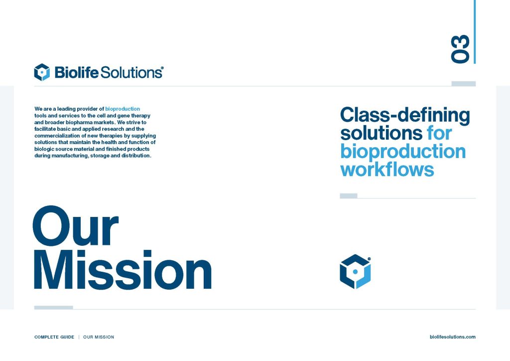
Class-defining Solutions for Bioproduction Workflows
Brand Documentation
Brand Guide
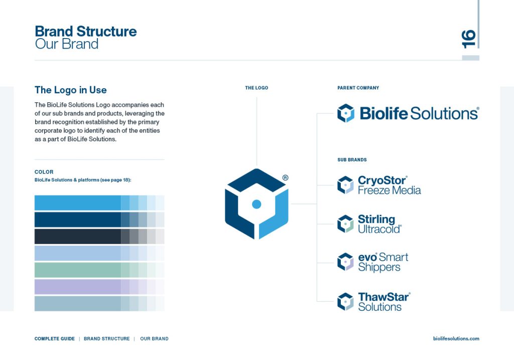
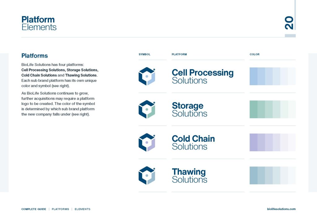
Following finalization of the visual brand, a Brand Guide was created to document specifics of style, colors, fonts, approved usage, etc. The guide also provided an explanation of the new brand architecture as it applied to BioLife's main platforms, along with signature color treatments to identify each platform and its associated product lines.

Brand Applications
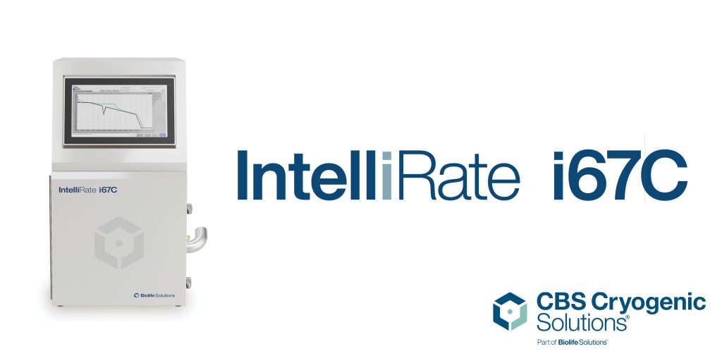
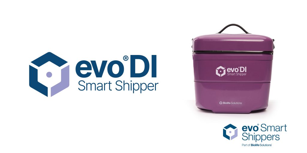
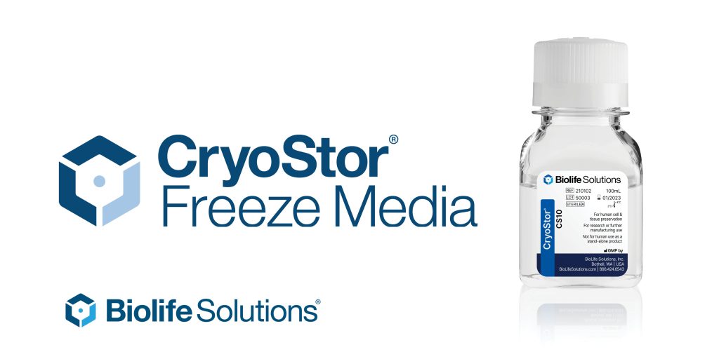
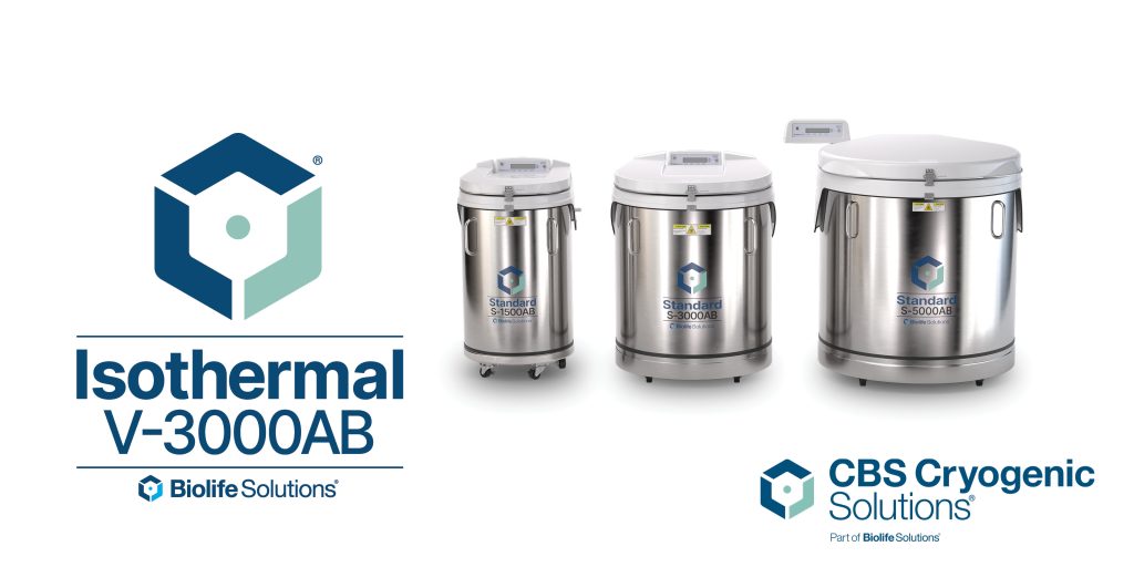
Brand in Use — Expressions Across Multiple Platforms
Rebuilding the BioLife Solutions brand posed a number of challenges due to the company's rapid growth over a roughly 3-year period. During that time several companies were acquired by BioLife as it sought to complement its core offerings with a more comprehensive portfolio of products and services designed to support various phases of the bioproduction workflow. As some of these acquired entities had substantial brand equity of their own, the Marketing Team was tasked with incorporating existing brands into the parent brand while retaining enough of each entity's identity to leverage existing name recognition in their individual markets. This was a primary driver behind the need to develop an iconic logo that would allow continued use of the acquired company names and still reference BioLife Solutions. Below are a few examples illustrating application to product and video.